
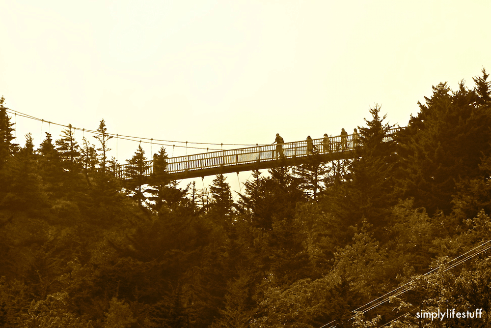
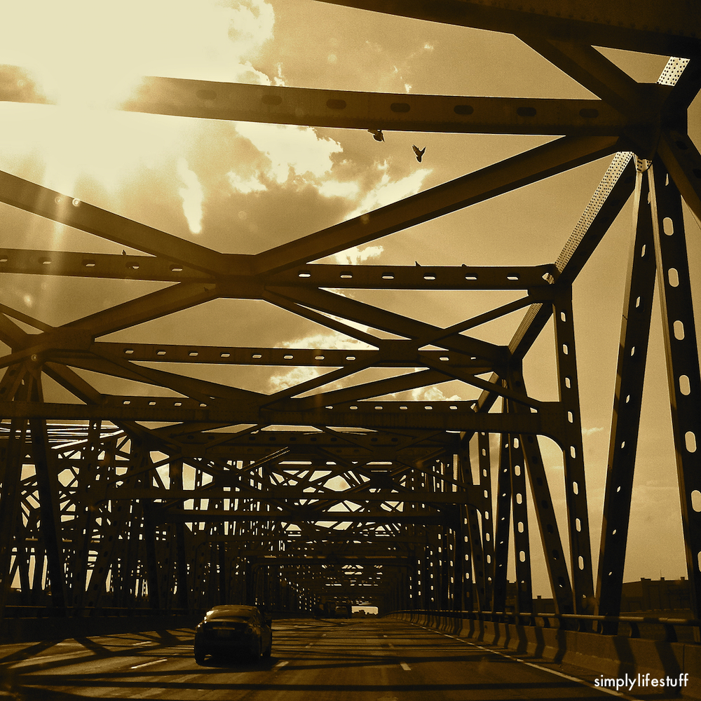
This week’s Which Way challenge over on Cee’s Fun Foto Challenge is BridGeS. I decided this week to present all of my images in sepia because I love the way architecture looks with this effect applied.


Grab your camera or look through your archives and join in the fun.


Hi Melanie,
I love the sepia effect, especially on the old stone bridge. Beautiful post.
@naomi, thank you very much for your kind words. It just seems that sepia “sometimes” brings out the detail in architecture.
I didn’t know what it was that I liked about the use of sepia, but I think you have articulated it very well.
Marvelous. I adore the sepia tones. It does bring out the details, because your eyes aren’t cluttered with colors. Thanks so very much for playing along!
@Cee, thank you for the kind comment and I always enjoy playing along!
Great photos! I am a particular fan of #3! My husband took a great photo of the Golden Gate bridge and he also added a sepia effect to it. Great minds…
@blairsaysblog, thank you so very much for your kind comment. I do like sepia at times.
Like everyone else, I also like your use of sepia 🙂
Thank you very much.
These great sepia effects have inspired me to dust off a couple of my photo effects apps and give them a try again. Nice shots. ~James
@gallivance, so glad they inspired you. I look forward to seeing some of your sepia photos. Thanks for the kind comment.